RGB
Red, Green, and Blue are “additive colors”. If we combine red, green and blue light you will get white light. This is the principal behind the T.V. set in your living room and the monitor you are staring at now. Additive color, or RGB mode, is optimized for display on computer monitors and peripherals, most notably scanning devices.
CMYK
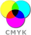
Cyan, Magenta and Yellow are “subtractive colors”. If we print cyan, magenta and yellow inks on white paper, they absorb the light shining on the page. Since our eyes receive no reflected light from the paper, we perceive black… in a perfect world!

The printing world operates in subtractive color, or CMYK mode.
In practice, printing subtractive inks may contain impurities that prevent them from absorbing light perfectly. They do a pretty good job with light colors, but when we add them all together, they produce a murky brown rather than black. In order to get decent dark colors, black ink is added in increasing proportions, as the color gets darker and darker. This is the “K” component in CMYK printing. “K” is used to indicate black instead of a “B” to avoid possible confusion over Blue ink.
Always deliver your digital images in CMYK-mode!
One of the most common errors made by inexperienced graphic designers is submitting RGB files. As a result we must ask if they would like us to convert to CMYK before we send the files for film output. Most of the time, the color change that will occur is slight. However, every once in a while, the color range after conversion is compressed during the transition to CMYK mode resulting in a complete change in color tones. Be warned that there is absolutely no way to get that deep RGB blue using CMYK, no matter how much we want to.
CMYK color shifts
Designing full color (CMYK) artwork for CD-ROM replication projects can be tricky. Since a disc is made of plastic it has different printing and ink absorption properties than paper. It is near impossible to exactly match CMYK colors between your inserts and labels.
Since CMYK colors on the CD label can shift dramatically MJK Disc Productions cannot be held responsible for color deviations due to the limitations of the silk-screen process. Unfortunately, even film-based proofs for the label artwork are not guaranteed.
For technical reasons colors can shift from the start of your run to the end, so no color match warranty is ever expressed, written or implied by MJK Disc Productions with regards to CMYK CD label printing color matching.
Tips to avoid disappointments
- The easiest way to ensure color accuracy is to use PMS spot colors
- Keep your design simple.
- Unfortunately, there are no totally accurate means for viewing what the actual printed surface of a CMYK label will look like before you begin production. Even seasoned professionals cannot anticipate many of the undesirable effects that may occur from time to time while trying to color match. CMYK Proofs are to be used only as guidelines.
CMYK Workflow
When designing for CMYK printing there are a few application specific tips to follow:
Photoshop
Your scanner almost certainly generates RGB information. Don’t worry, that’s how it’s supposed to work. In fact, you should leave your color files in RGB mode until you need to finalize your project, or until you need to know CMYK ink values so you can match colors in another program. While you are working you can check how your files are going to look by turning on the “CMYK preview” mode.
Don’t make repeated changes between RGB and CMYK mode, using the mode menu. Every time you switch, a little clarity is lost. One switch is no problem; 20 switches makes a difference.
So why not simply switch to CMYK mode as soon as possible?
- RGB files are 25% smaller and therefore 25% faster to work with and easier to store.
- The SWOP CMYK gamut is pretty small. If you ever want to reproduce those files for a different medium (such as the web), you’ll have thrown away some potentially useful information.
Illustrator
Stick to CMYK and Grayscale color models when working on the paper parts of your project (booklets, traycards, etc.). If you use Pantone Coated colors on anything paper, make sure that you are willing to pay all the associated up charges. Stay away from RGB. Refer to http://www.adobe.com/ and the program’s help section for details.
Pagemaker
Menu choice WINDOW contains the “Show Colors” palette. This program functions much the same way as Illustrator and Quark in that you can add custom swatches for use in your document. Refer to Adobe’s web site and the program’s help section for details.
QuarkXpress
Familiarize yourself with the “Edit Colors” dialog box. Use only CMYK mode and ensure that the spot color checkbox is off. Make sure that you are in control of which colors should separate into CMYK by installing a post script printer and using the output tab in the Print dialog window. Be aware that Quark’s ability to represent color accurately is, shall we say, less than ideal. (use a swatch book!)


Leave a Reply